
Product design, 1 info/arch, 3 developers, 2 product managers
10 months
Product design lead (Contract)
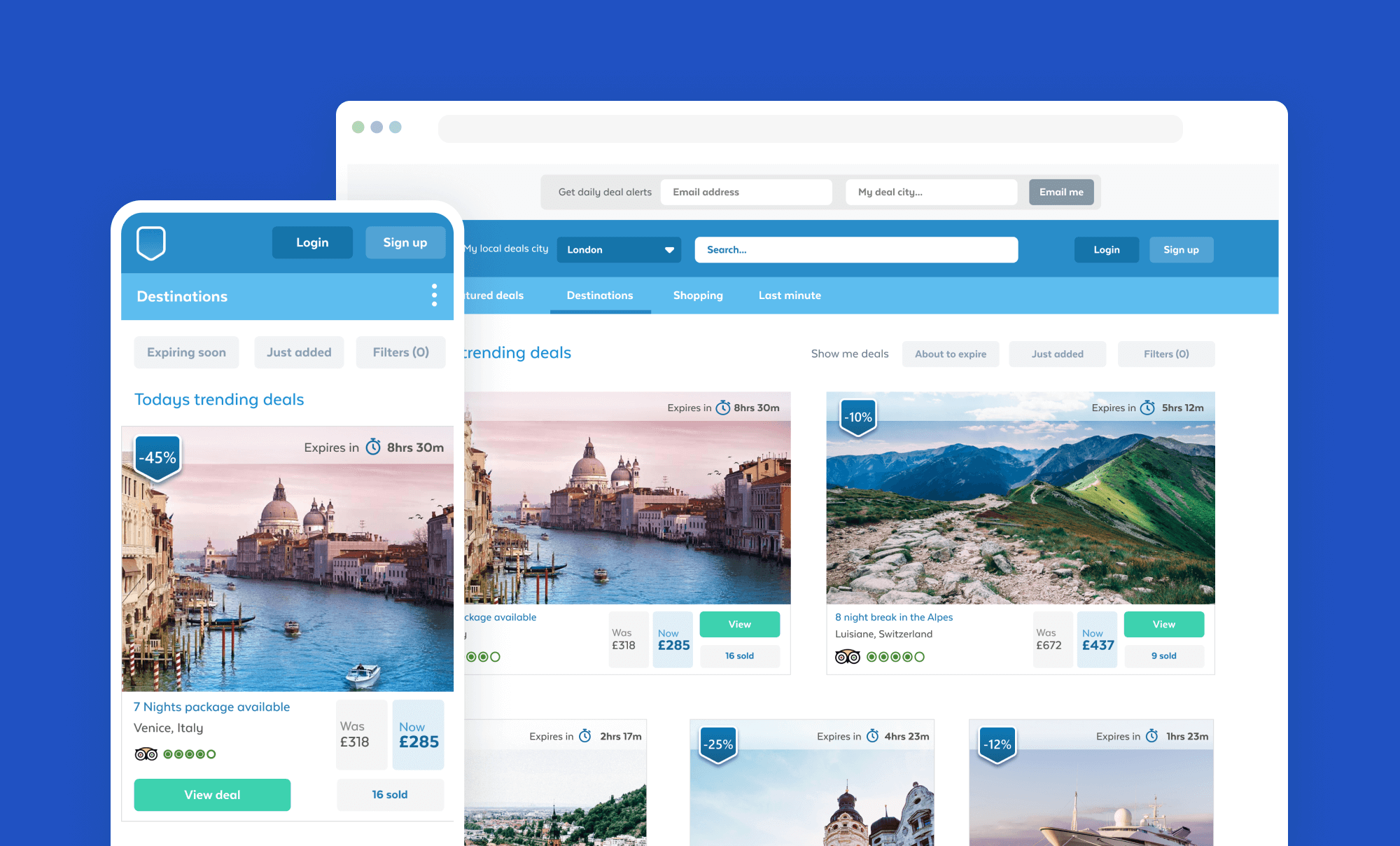
KGB Deals was one of the biggest daily deal sites around, providing offers and discounts for almost anything since 2010. They're owned by the New York-based KGB. They offer local deals in cities all across the UK, including London, Edinburgh, Manchester, Liverpool, Cardiff, and Belfast, meaning that wherever you are you should be able to track down a KGB deal nearby. They also have specific sections for travel deals and shopping deals, so it’s even easier to find the offers that you’re looking for.
I was brought on board to help with the website redesign and rebuild. Part of the new product strategy was to also incorporate ecommerce capabilities into the new version of the platform. A relatively straight forward project that I enjoyed working on including the team that I also worked with.
The following product opportunities and limitations where identified by the product team:
An ambitious set of challenges and tasks lay ahead of the team to deliver a completely new platform. Our challenges covered:
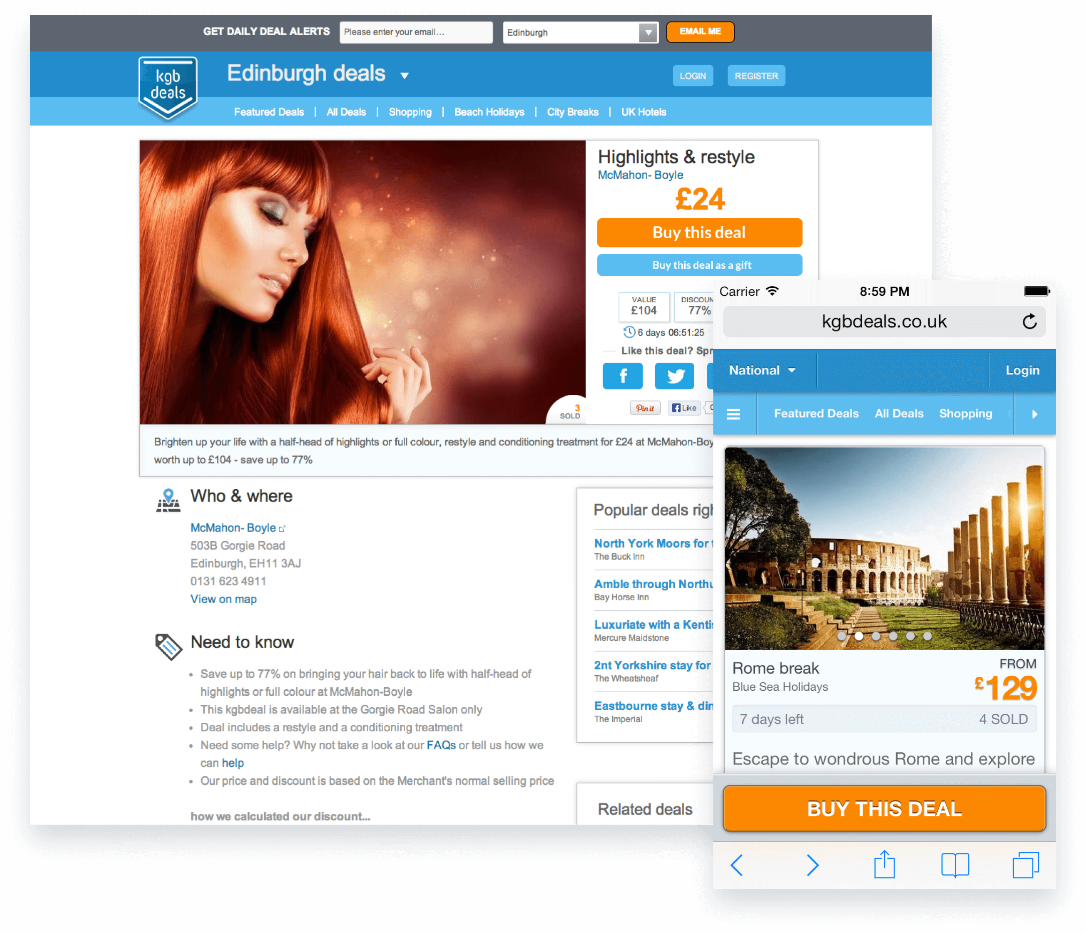
A rather dated website design and format as I am sure you will agree. The orange was added by the marketing team as they believed that the bright bold colour would have more of an impact to users. The brand and marketing team wanted to retain the blue colour theme as this was baked into the core branding and communications languages. As a team we did however have carte blance to redesign everything else. We also won the argument to change the font stack to something better.
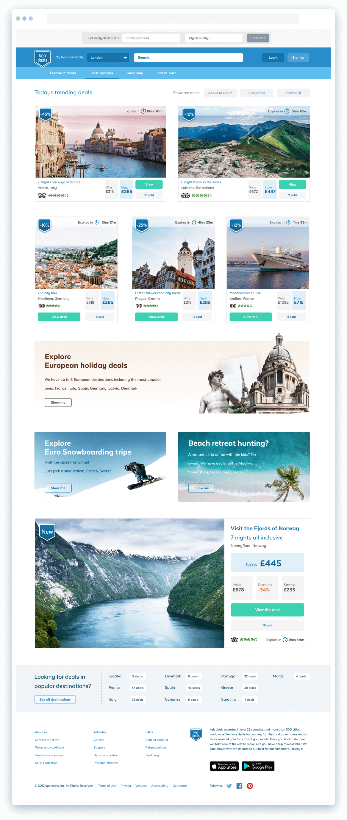
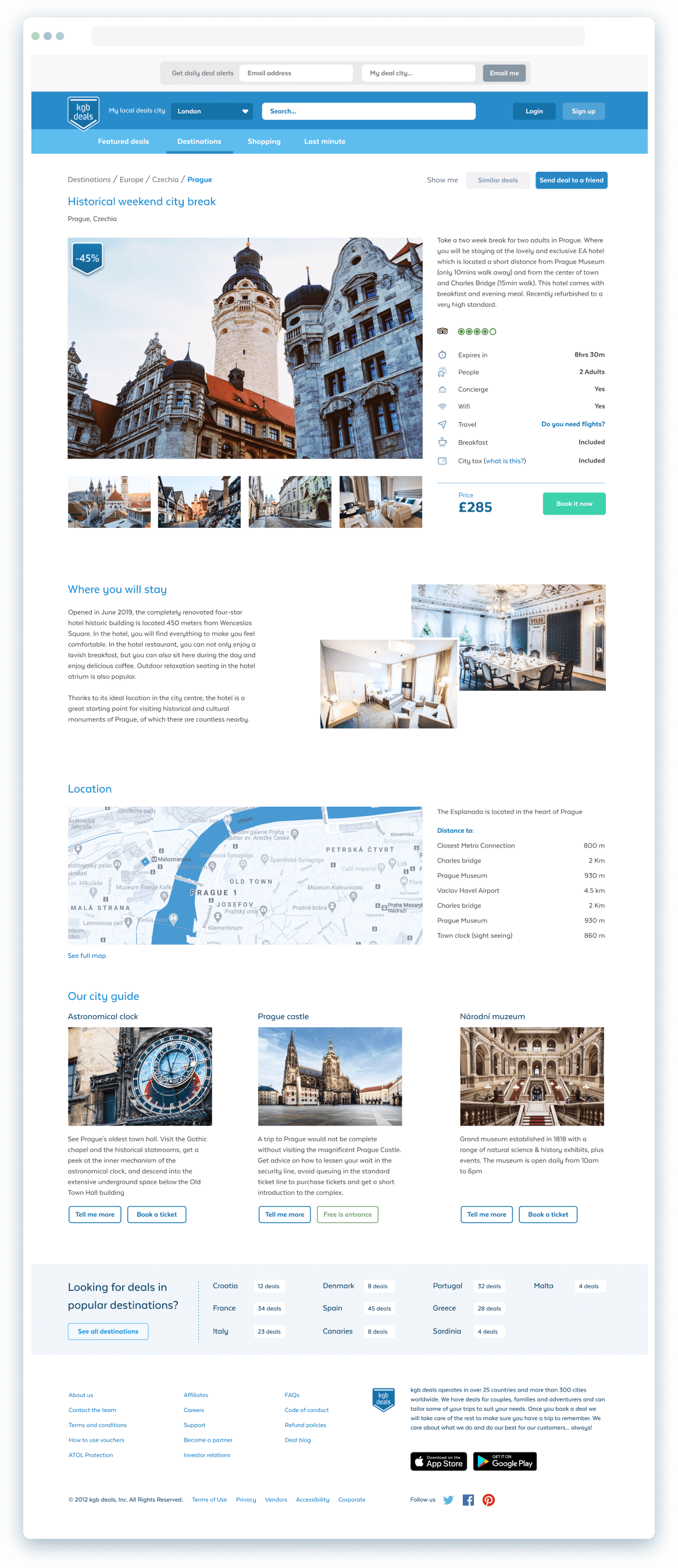
A new simpler destinations landing page was designed increase deal impact visually. The layout allows the page to be setup as a 1x1 (hero deal) a 2x1 or 3x1 deal stacks. All of which collapse down gracefully into tablet and mobile viewports.

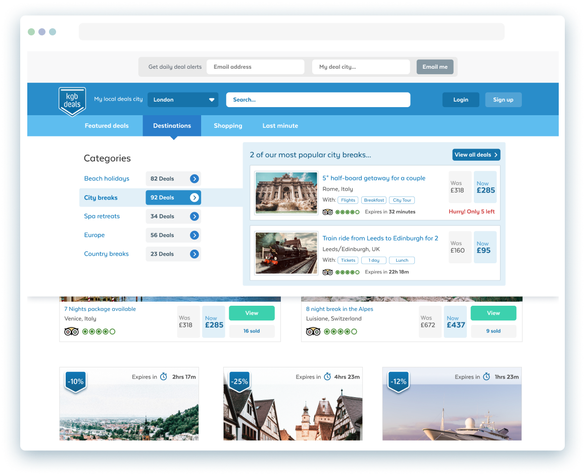
Dynamic menu drop down allows for the updating of deal content which is driven through daily sales data for deals and offers. The sales team or user can over ride this of course and promote specific deals that a client has paid a premium for.

Based on the original sales teams request to have the ability to create keyline hero sections or ‘panels’ to help promote categories of deal items. When working with the original product team this then evolved iteratively into a widget feature within the CMS to allow for the creation of these types of panels.
Fully customisable promotional panels can be easily created in the Content Management System. Users can choose from pre existing templates and then customise the content as they like or create a new template from scratch.
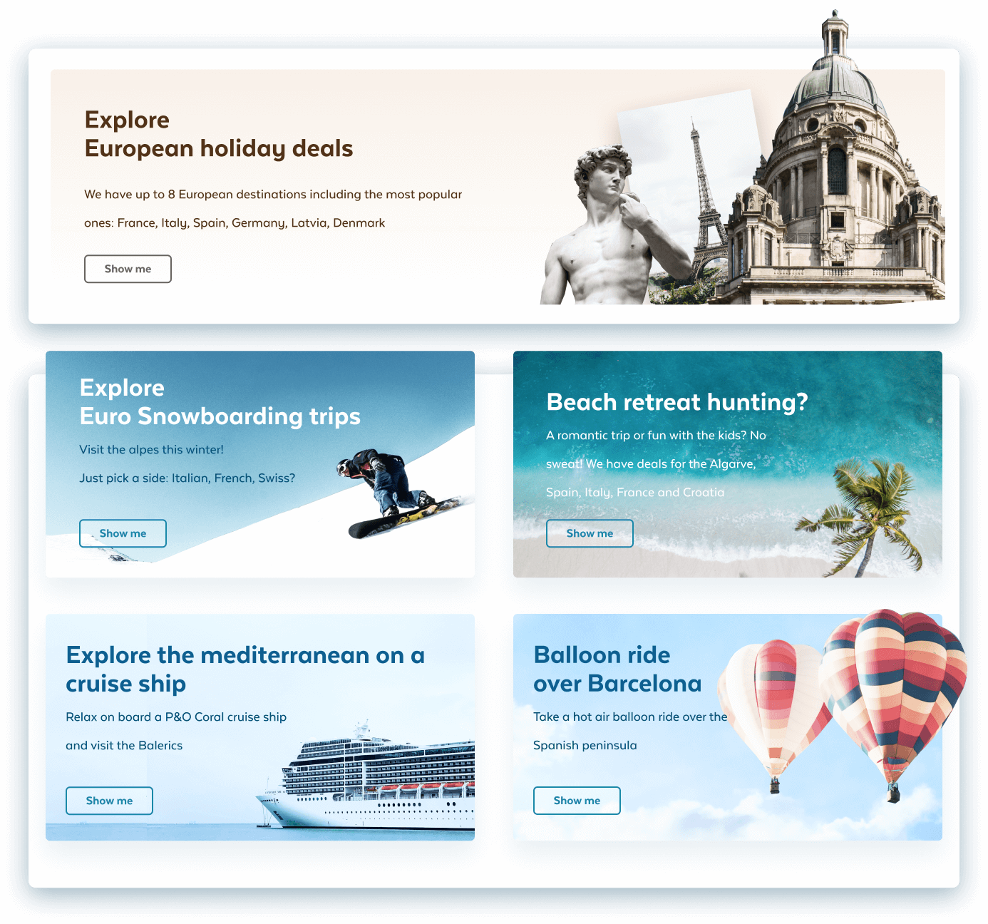
Fully customisable promotional panels can be easily created in the Content Management System. Users can choose from pre existing templates and then customise the content as they like or create a new template from scratch.
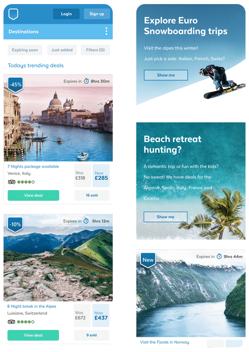
Simpler mobile UI
A nice platform and project to work on however the platform was later sold off to a competitor platform and the content and products merged in the the new business. Even so the team I worked with was amazing and there were some super talented people there.
Back to home