
Myself and 2 Product Managers
24 months
Product design lead
Concrete Media offer clients, such as Marks and Spencers, a Enterprise Management Platform (EMP) that allows clients to successfully and seamlessly manage their retail operations. The plaform allows clients to create projects and tasks, analyse various items of retail and store data, manage people, content and more; all from a single platform in the cloud.
As the sole designer for this effort I was brought on board to help re-think the user experience from the ground up, apply a new and refreshing look and feel and work with product on a variety of new product features. I worked through all stages of the design process from user journeys, wire-frame creation, prototypes through to high-fidelity and dev ready designs.
When I joined the team at Concrete in London they were working on the new retail platform titled CPX (Which stands for the Concrete Platform Experience). This platform was very functional and the designs were essentially driven off wireframes which were produced by an external agency whom they have engaged with for UX help. Hyper functional the platform lacked visual asthetics, a smoother UX experience and structure. Therefore I was presented with the following over-arching goals:
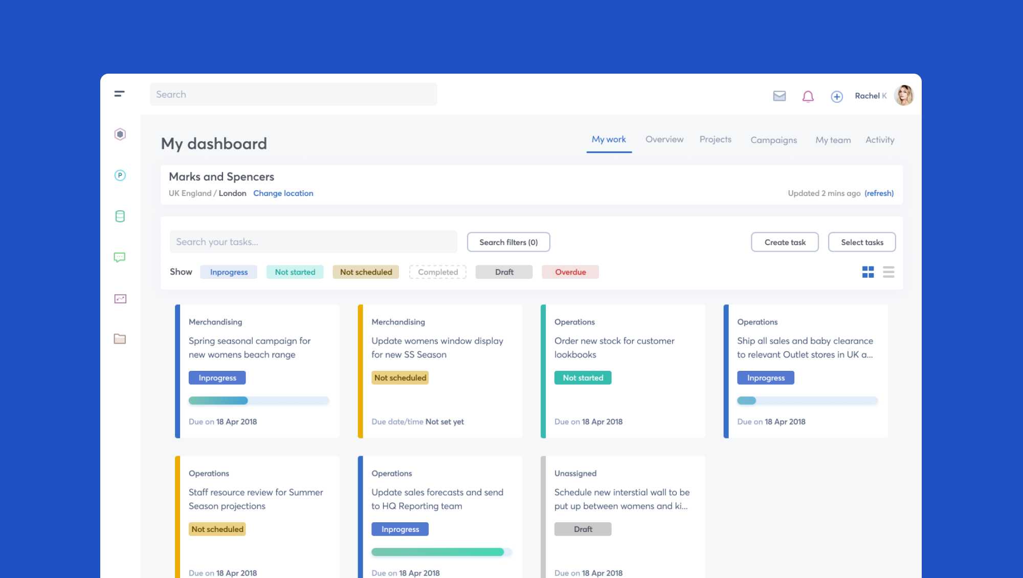
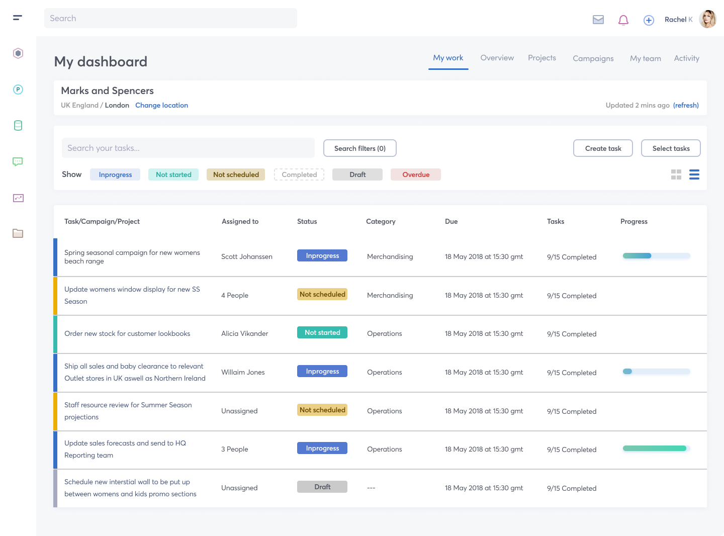
The first challenge was to create a more intuitive dashboard to allow for the management of a users assigned and owned tasks.
With an aim of addressing the following UX and UI issues:
Solve a poor table layout experience across desktop and mobile
Content (tasks) need to show specific details and overview information
Allow user to easily filter and search for tasks
Investigate colour palette and look and feel
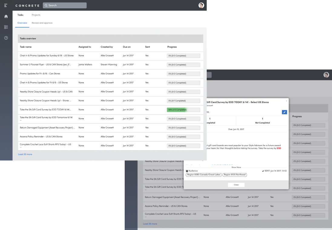
The existing UI was very functional at best and compromised of a tabular view for navigating tasks. We knew from previous feedback that this layout didnt work well on mobile devices for obvious reasons. The engineering team has a crude layout in place but this was cumbersome at best. Previewing a task was realised with use of modals. The down side of these modals was in the limited real-estate and the fact that some modals had mini workflows contained within them. I generally try to avoid this approach where possible.
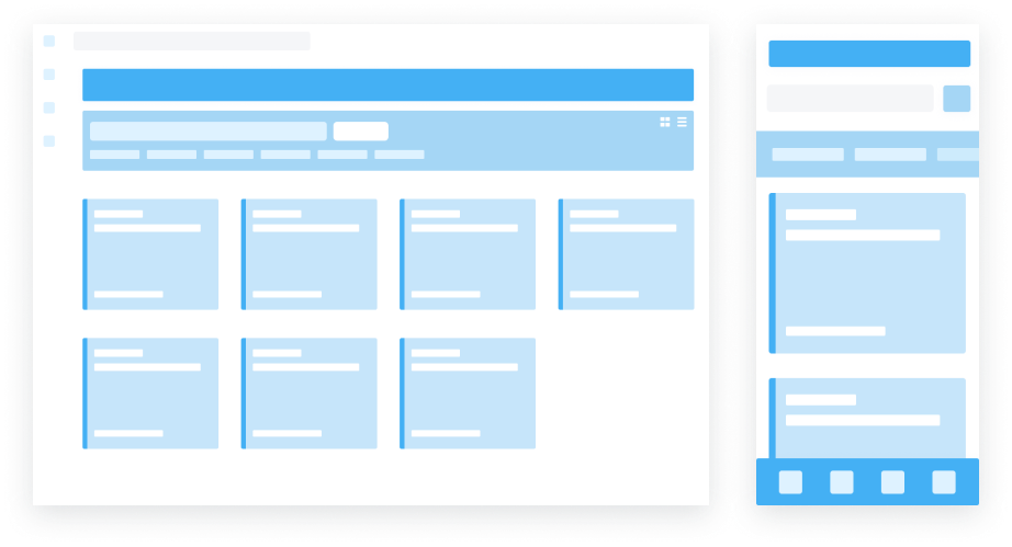
The initial thought here was to adopt a UI pattern offering a card based layout solution that would work much better across any viewport device. Given the platform controls some additional UI features would be added to give a more suitable mobile experience for example the lower nav bar and slidable nav bar for navigating task types. You can read up more about this pattern here.. Generally when I explore UI patterns I tend to reference either Googles Material Design Library or a vendor like Carbon from IBM which I like but thats a personal choice. Or I do the usual and see what other vendors or competitors do. Plus there are rafts of online UI paterns places to visit like Pattrns.com.
The initial thought here was to adopt a UI pattern offering a card based layout solution that would work much better across any viewport device and give greater flexibility to the UI as a set of components that can be reused.
The data and upon talking to some of the customers pointed to the fact that the majority of staff prefered a desktop experience over mobile. Therefore mobile requirements would be addressed later however we needed to try and make the UI components as mobile friendly as possible so that we can easily expand onto this platform at a later date.
Following feedback it was therefore also decided to retain a tabular layout feature for desktop users and allow the user to toggle view modes for card or table views.
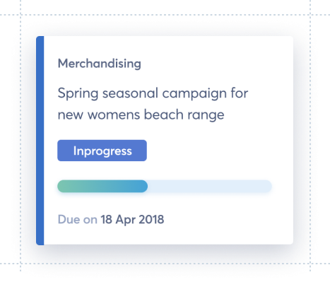
A card based and tabular alternative layout to suit the users needs.

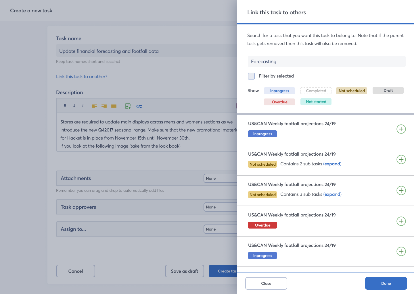
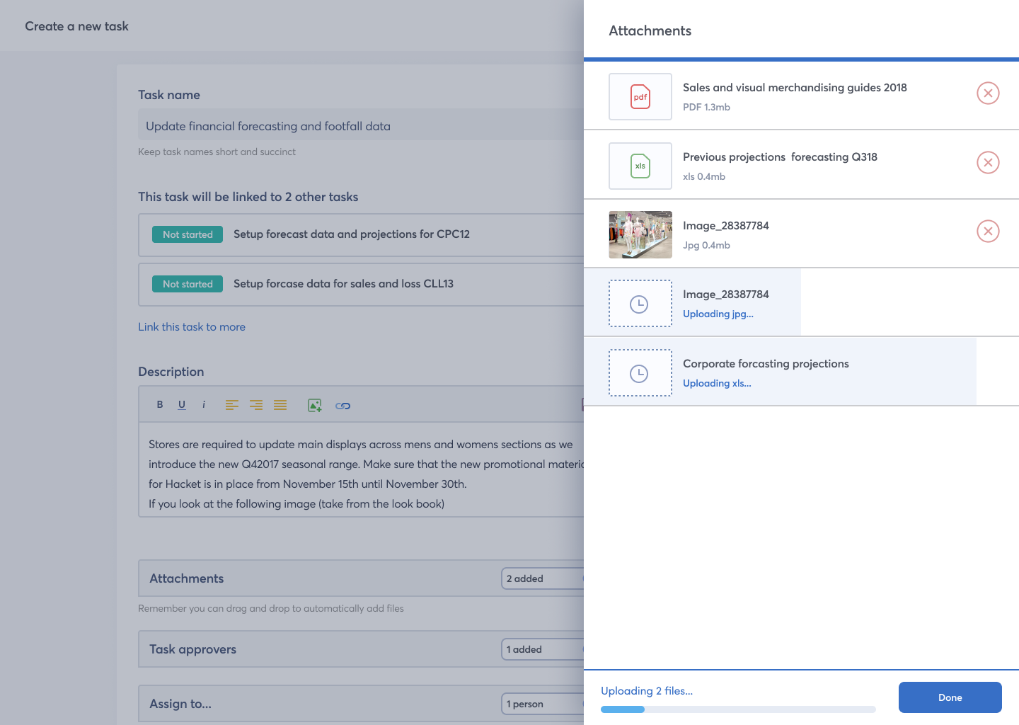
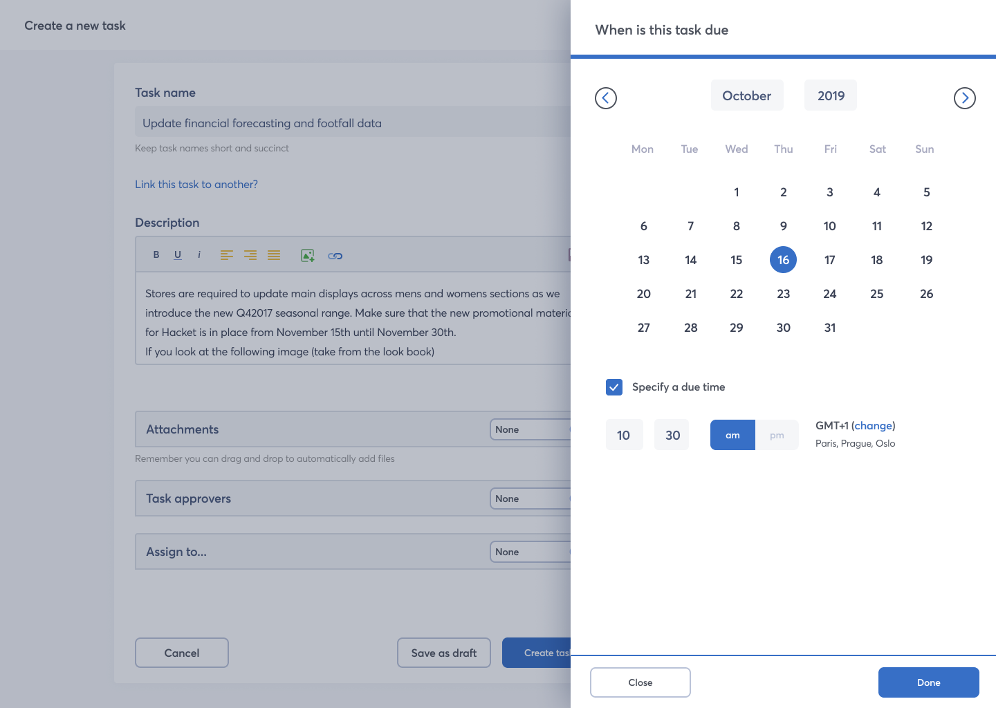
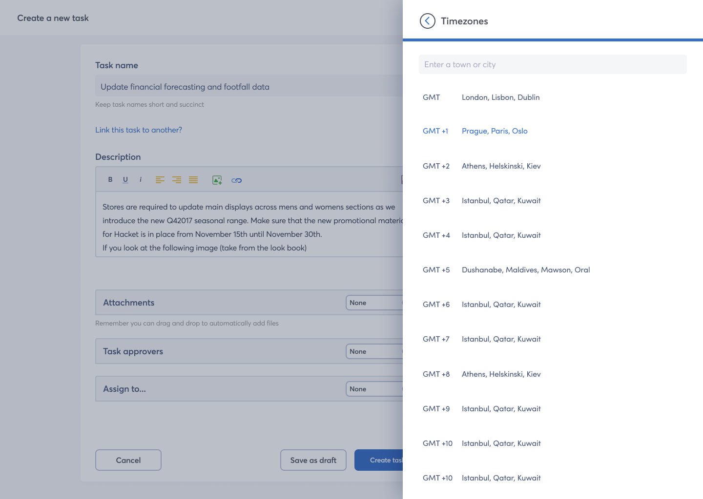
The second task was involved sorting out the UX and UI for task creation. There were two elements of complexity for task creation which needed to be carefully considered:
The exiting UI was all done within a floating modal which was rather long and contained elements of complex UI. I tend to avoid having complex modals where possible as they just present issues for UX down the road and its simply not an elegant solution.
After consutling with the Product team we decide to isolate the task creation to its own screen in order to keep the user on-task and on-focus. Following an agreed UI pattern we utilised a flyout side panel to allow for any complex features that the task needed e.g. adding attachments, assigning the task or linking to other tasks.
The finished visuals for task creation. Dev ready and uploaded to Zeplin.
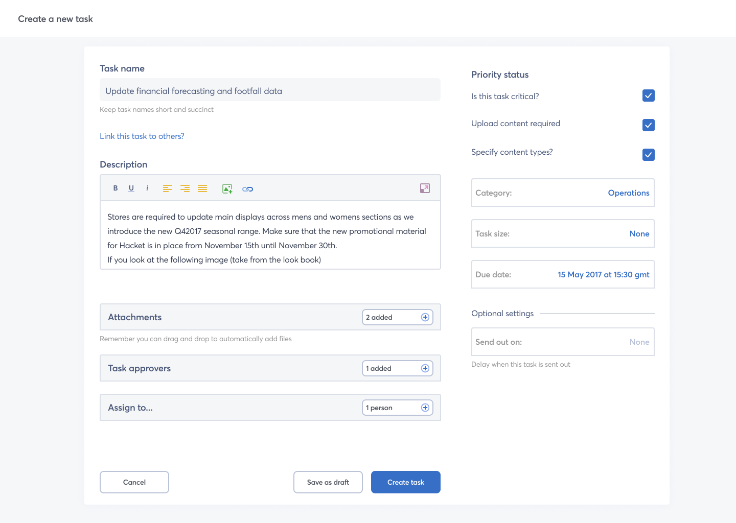
Allows the user to stay within the context of the task on desktop and then browser and link to other tasks.
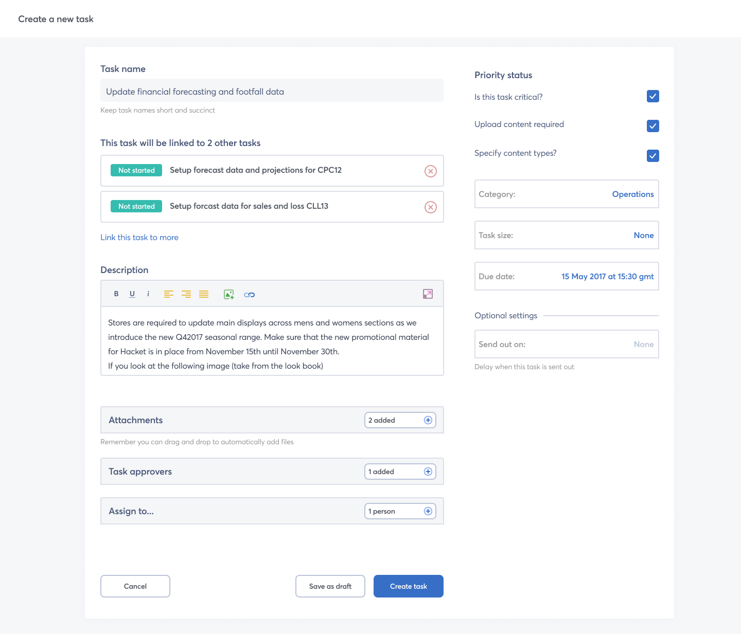
Upload progress are visually indicated by background loading bar. There is an additional progress bar adjacent to the Done button.
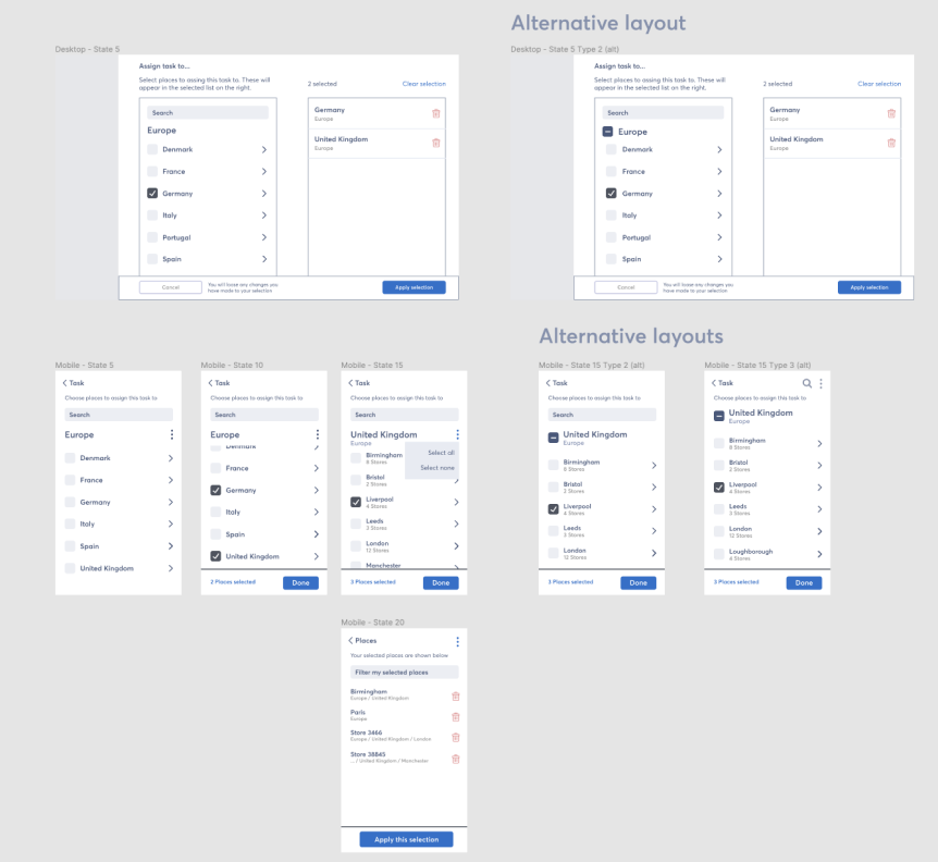
This particular task was probably the second most complex aspect of the platform I was asked to solve. The request can be defined like so:
In order to understand this request I arranged a few one-on-one calls with the product manager to go through this task in detail and make sure we were both on the same page. I also wanted to discussion some fundamental UX issues I had with the proposal.
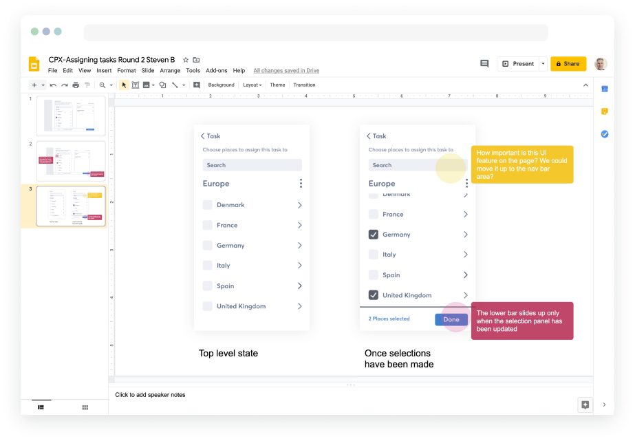
As we were both remotely working I proposed on using Google Slides to create some crude and make shift wires.
Why Google Slides? Well its collaborative for a start and most digital/product people know how to use it. Plus if we need to quickly bring in any other stakeholders (the MD for example) then they wont be faced with a crazy new tool to interact with and they can join in. There is also the added benefit that people can go away and review this in their own time and still contribute.
I also like to invite as many initial key stakeholders as I can.
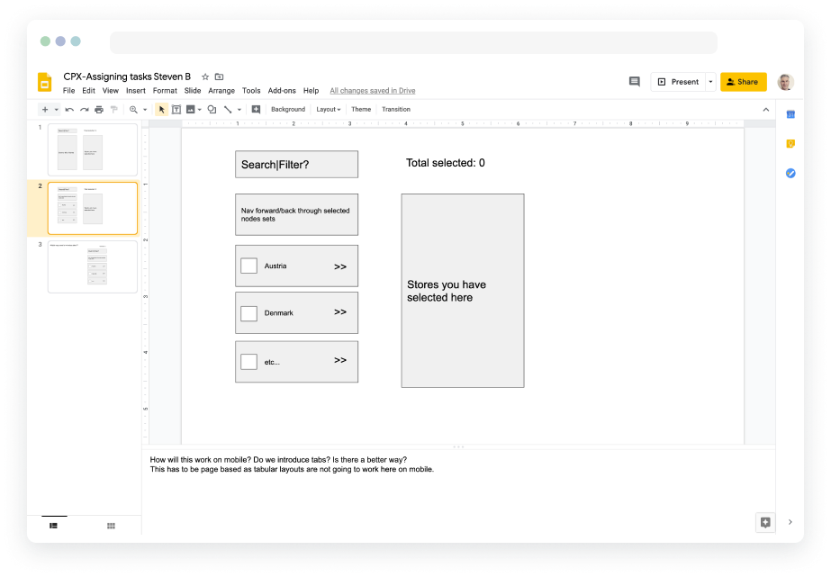
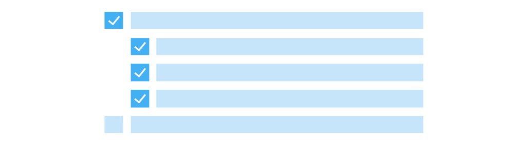
During one of the calls I raised an ux issue for users when selecting parent nodes refering to point 2 above. Users are familiar with the model that when you select a parent node then all children are then selected by default (makes sense right?). If we break this behavior then its going to be an odd experience. All-though we could utilise a partial selection model like you see on Gmail. Which is when your "select all" checkbox has a line through it [-] because you deselected some rows. I just needed to bear this in mind when concepting.

These initial meetings (using Google Slides) allowed us to define some fuzzy solutions collaboratively. This means that I can then go away and work up some more detailed solutions on my own. For this part of the task its a case of doodling with pen and paper the mechanics of these requirements. No real process just a case of quickly working out some flows and data structures for pages. The following images show some of my sketches.
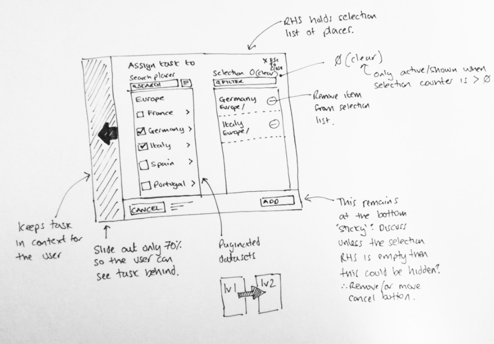
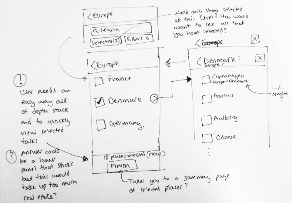
Once I have spent enough 'thinking time' on my own working out some possible models I will usually bang out some crude lo-fi visuals to help explain my solution and rational. Enough at least to kick start another iteration of discussion.
I then pop these run outs into Google Slides again so I can initiate the next meeting and collate feedback from the product team. Remember that I run these sessions interactivly so any participants can add ideas to the designs.
Most of the process now involved iterating this process whilst gaining product feedback. Once we think we have a workable solution the next stage is to prototype up something. So it's either on to Invision or a crude html/css mock up if possible depending on the time we have available.
Concretes new platform was launched in spring of 2019 and really stands out from its predecessor platform. It was released in strategic steps and the first client being Marks and Spencers in the UK. This allowed us to guage feedback and identify any bugs or UX issues that the client experienced. Overall the feedback was largely positive.
Back to home